

Friday, October 29, 2010
Skaraoke!
Just when you thought Johnny Rad's couldn't get any cooler....
 Skaraoke! My new favorite word, verb, and holiday activity-who's in???
Feeling Lost.../ Stream of consciousness problem-solving
We've reached the middle of a really intense semester and I already feel like I've lost my steam. This campaign project is throwing me for a loop and now I'm scared that all of the other projects to come will throw me too! Aaaah!!!
I know that the problem with my social cause campaign is a lack of clear focus but I just can't seem to nail it. I started with the "fast food is bad you shouldn't eat it" approach and then veered into "do you know what you're eating?" abandoning fast food altogether. The new direction is a lot better than the fast food campaign was but it's still completely unfocused. Let's look at the pieces I have so far:


 Ok, so I think the kids are out. Childhood obesity is really a whole other campaign. So if I'm focusing on knowing where the food comes from the science lab is good with tweaks, the factory is good but needs to be less concentration camp-y. Or does it?? These factory farms are basically concentration camps for cows and pigs and chickens so why not link the two? Or is that too scary?? Probably yeah-ok, so we'll keep the factory but make it more factory like.
So now my two biggest problems are 1: my copy, which is a big hot mess; and 2: my third piece.
Ok, so the point of this campaign is to make people want to be more aware of where their food comes from. I'm doing this by showing places where the majority of food is produced that just doesn't seem quite right. Food should come from farms and gardens, not factories and science labs. Where else isn't quite right?
Ooh, what if I compared and contrasted? I know we shouldn't show cause and effect but compare and contrast might be what I need to do. Like if I showed a factory next to a sunny farm. Showed a garden next to a science lab? A happy butcher next to mean looking executives??
To be continued...
I know that the problem with my social cause campaign is a lack of clear focus but I just can't seem to nail it. I started with the "fast food is bad you shouldn't eat it" approach and then veered into "do you know what you're eating?" abandoning fast food altogether. The new direction is a lot better than the fast food campaign was but it's still completely unfocused. Let's look at the pieces I have so far:


So now my two biggest problems are 1: my copy, which is a big hot mess; and 2: my third piece.
Ok, so the point of this campaign is to make people want to be more aware of where their food comes from. I'm doing this by showing places where the majority of food is produced that just doesn't seem quite right. Food should come from farms and gardens, not factories and science labs. Where else isn't quite right?
Ooh, what if I compared and contrasted? I know we shouldn't show cause and effect but compare and contrast might be what I need to do. Like if I showed a factory next to a sunny farm. Showed a garden next to a science lab? A happy butcher next to mean looking executives??
To be continued...
Show & Tell/ Favorite Words
Last week in class, we had to come prepared with a list of our favorite words. I found that this was an interesting little project for a number of reasons. For me, it was initially a bit of a struggle since even though I use words every day, I don't think I've ever thought of any word as being a "favorite" word. I started out with the words epic and amalgamation since they are two words I've noticed as being trendy lately-I also would like to think that my old band, The Mishaps, were at the forefront of the epic trend with our epic sound-an amalgamation of punk and heavy metal rock and roll. Sorry, I really couldn't help myself!
Another thing I noticed as we were going around the room listing our favorite words is that everyone's favorite words were quite illustrative of their personalities. The words I ended up choosing were mostly words that I enjoy saying because they're just so damn cute and fun to say--words that always bring smiles:
cozy/ warm & fuzzy/ bumble bee/ cupcake/ glissando/ iridescent/squiggle/ atomic/ cuddle/ strawberry/ karaoke/ bubble/ blossom
Wednesday, October 20, 2010
What I Did Today
This is what I did today:


This is part one of my typography assignment for the week: to illustrate depth and texture with typography in a table of contents page. I got the idea for this piece from yoga class.
This is part two of my assignment: to work without a grid. Or something like that...I'm real tired. The inspiration for this piece came from the color guide. Yay for color guides.
The lesson I learned from doing these pieces is to never procrastinate on typography assignments again. They take a long time, they're hard and seven hours straight in the design lab leads to an unhealthy crazy feeling. Time to go work on my campaign project...after I eat a large meal.
Tuesday, October 19, 2010
Dandys Rule, OK?
Today as I was crawling around the interwebs, I happened to stumble upon The Dandy Warhol's band website and was thoroughly impressed by their design.
A band that sky-rocketed to rockstar status in the 90's with hits such as "Not if you were the last junkie on Earth...", "Everyday Should be a Holiday", and "Bohemian Like You" the Dandy Warhols have maintained a steady career trajectory and are currently touring on a greatest hits album: "The Capitol Years". Wondering what my favorite Portlandites have been up to recently, I went to their website to find out:
Link to the Dandy's Website
There's a lot going on here but I feel like it's all super well-organized. You have all of your (many) social networking links at the top, website navigation, and A BLOG! Woo!!! Here you can find out what frontman Courney Taylor-Taylor reads on tour (Thomas Hardy, apparently), the status of his hangovers, and who's coming to his hotel rooms for parties! Ah, the life of a rock star who just doesn't quit...
I especially like how all of the design elements of the page reflect the album art of the newest release. The typeface used is interesting and gives a 1940's vibe to the page, as do the scratchy black and white photos and the visuals in the new video presented at the top. The typeface reminds me of Citizen Kane for some reason, I don't know why. All I know is that I need that typeface now. Off to track it down!
Sunday, October 17, 2010
Show & Tell/ Call to action
For this week's show and tell we had to find a call to action. Inspired by the truth's anti-smoking campaign tactics, I found an interesting call to action example:

This conceptual piece calls for current smokers to quit. As illustrated by the "Quit" logo. Oh, those Brits are so literal, aren't they?

This conceptual piece calls for current smokers to quit. As illustrated by the "Quit" logo. Oh, those Brits are so literal, aren't they?
Friday, October 15, 2010
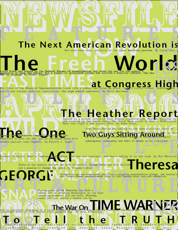
Table of Contents
This week, the majority of my time has been spent on creating these two table of contents pages for my typography class. As I love magazines and hope to design and write for one/some one day, I absolutely loved doing this project and put a lot of time and effort into it.
Unfortunately I was unable to get any feedback on my pages since I skipped class to go see Belle & Sebastian. Needless to say feedback is welcome here!
Page #1:
 This is my favorite, mostly because of the cleanliness of helvetica and my new favorite color-cyan 100. I hope to incorporate this palate into many designs in the future.
Page #2:
 A little more Time-y and conservative but I thought the large-scale use of Bodoni made it a little more fun.
Unfortunately I was unable to get any feedback on my pages since I skipped class to go see Belle & Sebastian. Needless to say feedback is welcome here!
Page #1:

Page #2:

Subscribe to:
Posts (Atom)