Tuesday, November 30, 2010

Infographic Tuesday

After having a nice little holiday break from class for a few days, I'm back in the swing of things along with my pesky little procrastination habit.  Infographic comps are due today and I feel totally lost and I really have no clue what I'm doing.

On the upside, I created a cute little illustration of the fab four circa '64:


Friday, November 19, 2010

Show & Tell/ Infographics

This is my good infographic:

Taken from Vanity Fair, it's an infographic about Bob Dylan's mind.  This is turning out to be a huge inspiration for my Beatles infographic-I love how they took the inspiration from Milton Glaser's illustration and fashioned it with tons of information in a visually appealing way that's easy to understand! The downside is that it's low res so you can't read it on here.  Boo.


Upon going in search of a bad infographic I stumbled upon  this 
article all about bad infographics.  Examples, what makes them bad, and what could make them better.  Needless to say this was my favorite bad infographic:


Not only do I hate the fact that a salad costs more than a big mac in general, this infographic does a bad job at telling you why.  The 3-D is completely unnecessary and shouldn't they be comparing like information? These two pyramids compare percentages against servings.  Also, the percentages aren't well represented visually.  Maybe the person who made this ate too many Big Macs that day...

Tuesday, November 16, 2010

MiniMoog Voyager Electric Blue

Seeing this post on vintage synth advertising today on the ISO50 blog reminded me of the analog synthesizer I dreamed to have when I first started playing in a band: the minimoog voyager electric blue.  Not only a marvel of audio science, but also a marvel in synth design.  Pretty colors and lights, and a big fat sound to back it up. 


I gave up the dream a few years ago when the cost was not only miles upon miles out of my reach (it retails for $3,495) but the sound of an analog synth wasn't really appropriate for The Mishaps.  Now that I'm in an electronic band, however...the dream continues.

Sunday, November 14, 2010

Sammy the Squid/ Phase 3 Comp


Better voice-over and sound effects to come.  I tried adding an audio track for the opening and closing credits but it threw my editing all off and I wanted to get this up here asap so you all could comment! Thanks!

Friday, November 12, 2010

Show & Tell/Package Design

Let's face it: earbuds are earbuds.  But panasonic finds a way to separate from themselves from the crowd:

How clever! The earbuds are packaged to look like music notes--and oddly enough they look like the music notes from the itunes logo...in fact panasonic seems to borrow a lot from apple here.  Lots of white space, sans serif font in a light grey color... Panasonic may loose points for originality but it's still a clever design that stands out on a shelf. 

Wednesday, November 10, 2010

What I did today/ Corporate Identity

Once again I'm posting a project from typography class. These projects come and go so fast it's like giving birth every week. And what good Mama doesn't like to brag about her children just a little bit?

This week I finished up a corporate identity package for the fictitious restaurant, a.spice. The main purpose was to develop a logotype and the subsequent materials featuring said logotype:


Creating your own typeface/logotype can be extremely intimidating however I learned that like most daunting tasks, once you break them down to their basic elements it all builds up quite naturally. It also reinforced what I already kind of knew-I love designing menus. Something about organizing a lot of information in a small space, the psychology of getting the customer to gravitate towards expensive items, making peoples appetites whet with color...I dunno, I love it!  Now if only I could do this for One World...

Saturday, November 6, 2010

A Lesson in Revision/ Do You Know Where Your Food Comes From?

Oh Project 3...I'm so glad you have left my life.  Let's take a look at your (crazy) evolution from start to finish:

Goal: To create a cohesive campaign advertise a call to action regarding a social issue. 
Campaign Idea: To illustrate the dangers of eating fast food.


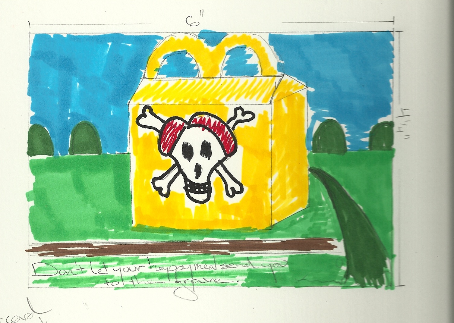
First I was scaring small children:


Then I scared adults:


And then I realized that I didn't have a clear idea and needed to change *everything*.  What to do, what to do? I needed to encourage people to think about what they're eating without insulting or scaring them....what to do? 

New Campaign Idea: Be aware of what you're eating.

Better...but then we took a field trip to a concentration camp for cows:


And let's face it, these children were scarier than the graveyard:


This was all clearly *not working*.  What to do, what to do? 

When in doubt, insert pretty pictures.  For my final presentation, I decided to compare the dark and dismal old pictures (which I thought were pretty cool (and free!) finds) of modern food processes that aren't quite right, with bright and colorful pictures of a better, healthier option. 

The final campaign:


Finally, something that I (and my professor) was happy with.  It only took how many weeks to get to this point?  However, I learned a lot through the process--A) Revisions are a designer's saving grace and B) Advertising is hard!

Friday, November 5, 2010

Show & Tell/Narrative: Kenna's "Hellbent"

For our show and tell this week I took advantage of posting our narrative choices on our blogs and selected one of my favorite music videos.  This video was made for the electronic artist Kenna's debut single entitled "Hellbent," released in 2001.

The video depicts an endearing claymation character on his search for happiness.  He eventually finds it within himself, and wants to share it with the rest of the world.  While his desire to market his newfound "Bliss" and spread it around is a noble one, it just doesn't quite work out for our quiet hero.  Watch to see what happens:

Monday, November 1, 2010

Matt & Kim/ New Era of Album Artwork

I love Matt and Kim.  Who doesn't love Matt and Kim? They're the cutest band ever! I was introduced to them about two years ago when a friend of mine needed someone to go to their show with.  Needless to say, I fell in love instantaneously and never looked back.  What I loved the most about them was that it seemed as though they lived in a cartoon world--Kim (drums) was drumming and grinning away while Matt (keyboard, vocals) was singing his tales of love and happiness against a backdrop of a comic-book town. It was as if they lived in a cartoon world! How fun!

Not knowing it at the time, the backdrop against which they were playing was actually the artwork from the album they were supporting at the time--"Grand".  With their new album "Sidewalks" about to be released, I got curious of what fans were in store for visually.  Behold:

 Yay for Cyan! I love it--I also love that some of the apartment building visuals from the previous album have carried over:


Upon visiting their website I found that this theme carried throughout.  It got me thinking about the state of the genre of "album art".   Ever since downloading has taken hold of the majority of music sales, the importance of the album artwork has been reduced (quite literally) to a 1x1 inch square.  However, with bands like Matt and Kim and the Dandy Warhols using their artwork as more of a visual theme that is carried out in their website, videos, live show, and promotional materials, the importance of album art is not lost.

Group Project/ Fun With Construction Paper!

Here's our small group project where we got to tell a story with construction paper cut-outs.  This is the harrowing tale of a young triangle who has some trouble fitting in with squares: